01
The service model was hard to scan
Seven disciplines existed, but visitors had no simple way to understand how they connected or where to begin.

A self-initiated, audit-led redesign concept that turns multidisciplinary engineering expertise into clear proof, intuitive pathways, and a more useful route into project enquiries.
Timeline
Multi-phase concept · 2026
Team
Solo: self-initiated design and build
Status
Self-initiated concept, not commissioned by POWEREC
Role and impact
I led the UX audit, information architecture, visual direction, interaction design, and responsive implementation. The job was not to make the company look more technical. It was to make an already capable engineering business easier to understand and easier to trust.
Product context and problem
POWEREC is a multidisciplinary Nigerian engineering company spanning power, MEP, automation, ELV, oil and gas, lifting systems, and EPCM. The original digital experience carried the breadth of that offer, but it did not help a technical buyer quickly understand fit, verify delivery experience, or confidently begin a project conversation.
The central design question became: how can a technical buyer move from a broad first impression to specific, relevant evidence without having to decode the organisation first?
01
Seven disciplines existed, but visitors had no simple way to understand how they connected or where to begin.
02
The company story spoke about capability without consistently connecting it to project scope, sector, and location.
03
Clients, delivered projects, and OEM relationships were presented together instead of building distinct layers of credibility.
04
A generic contact path made it harder for technical buyers to explain the type, stage, and requirements of a project.
The audit condensed the credibility gap into four problems the new experience had to solve.
01Before and after
The original website contained valuable information, but its navigation, rotating hero, proof signals, and contact prompts asked visitors to assemble the company story themselves. The redesign gives those same ideas a deliberate order so the experience moves from understanding to evidence to enquiry.
Navigation
First impression
Proof
Conversion
Before
Original website
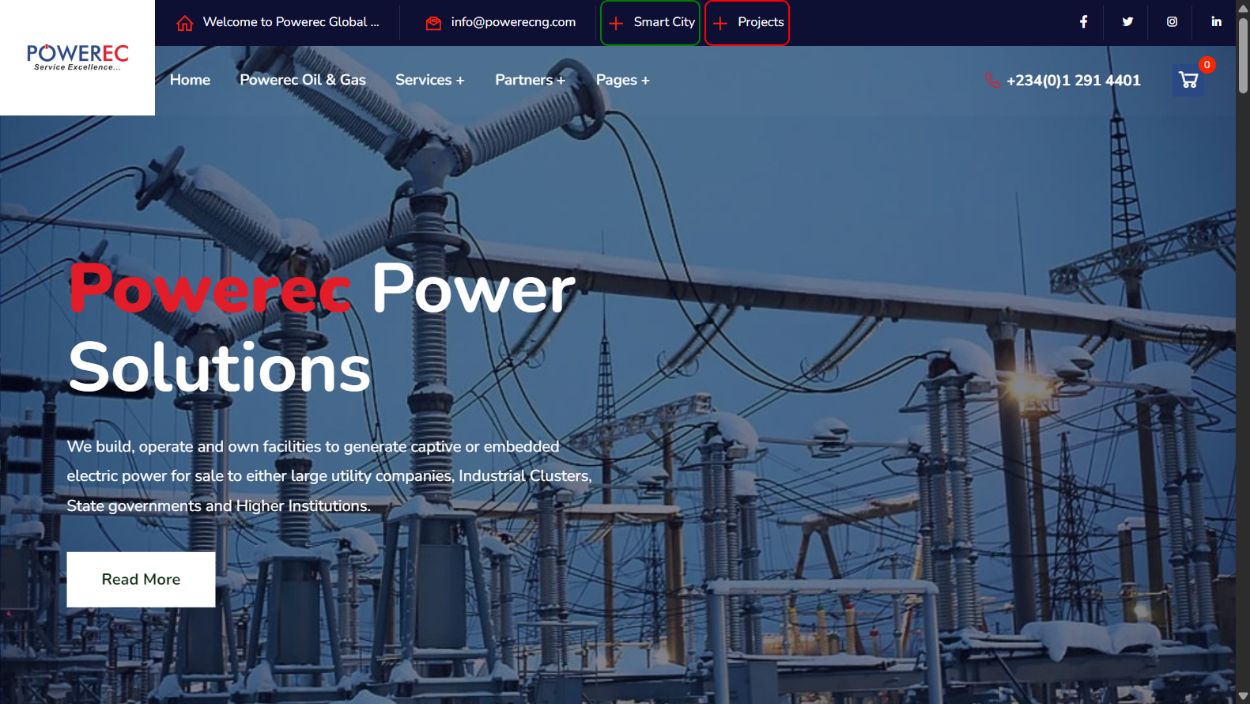
The original homepage used layered navigation and a rotating hero that positioned one service at a time as the first company impression.
BEFOREAfter
Redesigned website
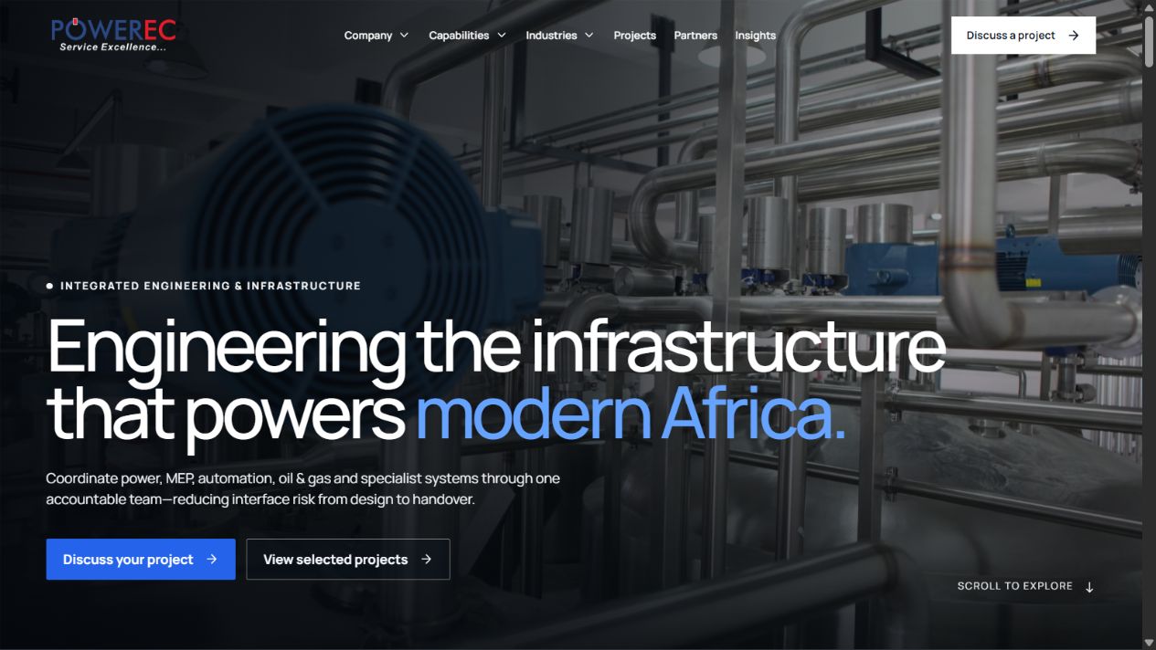
The new homepage starts with one integrated engineering proposition, simpler navigation, and direct routes to project evidence and enquiry.
AFTERA clearer decision journey
Rather than exposing the whole organisation at once, the site reveals information in a deliberate order: establish accountability, make the service model legible, connect expertise to evidence, and then ask for a useful project brief.
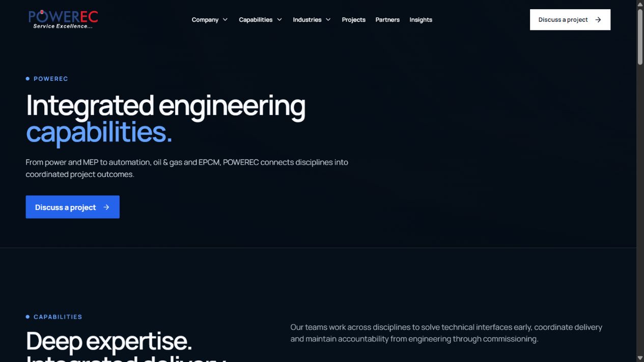
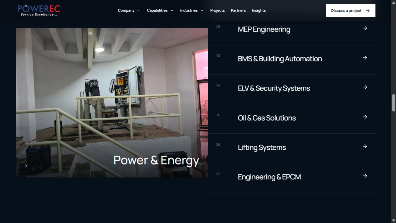
The capabilities page turns seven disciplines into distinct starting points while preserving one connected delivery story.
POWERECDiscovery and audit
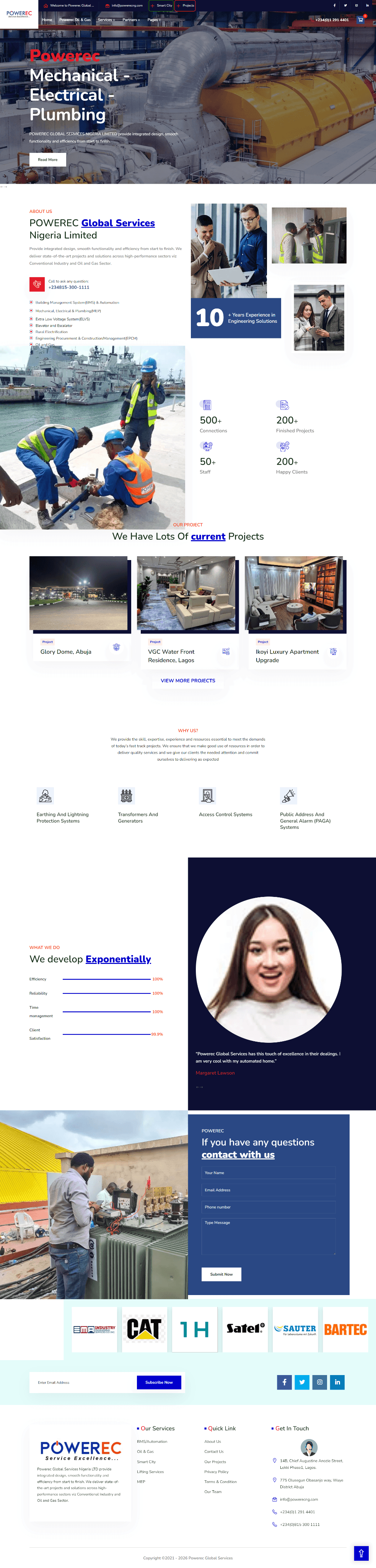
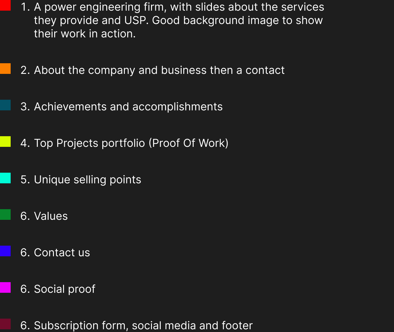
The work began with a UX and content audit across navigation, page depth, trust signals, project evidence, visual consistency, conversion paths, accessibility, and responsive behaviour. The most important finding was that the site needed stronger proof architecture, not more promotional language.
Competitor and category reviews showed that the strongest industrial websites behave more like evidence libraries than brochures. Project metadata, clear page hierarchy, and documentary imagery do more trust-building work than broad marketing claims.
Information architecture
The redesign was organised around a connected information architecture: Company, Capabilities, Industries, Projects, Partners, Insights, and Contact. Each layer answers a different buyer question, while shared calls to action preserve a clear route into project enquiry.
Each route has one communication job. That separation keeps the site easy to scan while allowing capabilities, industries, projects, and partners to reinforce one another.
POWEREC.com
Primary information model
Company
Who POWEREC is
Capabilities
What the team delivers
Industries
Where expertise applies
Projects
Evidence of delivery
Partners
Technology relationships
Insights
How the team thinks
Contact
How projects begin
Seven primary routes, each designed around a buyer question rather than the internal company structure.
02Interaction and art direction
Industrial interfaces can easily feel static or overloaded. I kept the visual system restrained, then used motion where it could improve comprehension: capability labels change the associated project imagery, active states remain visible, and transitions help visitors understand that the disciplines belong to one delivery system.
The walkthrough follows the redesigned experience across the live website while keeping the browser interface outside the frame.
03Capability pathways
The redesigned capability experience lets a buyer recognise their immediate need without losing sight of POWEREC's multidisciplinary value. The selected discipline changes the imagery and supporting context, creating a direct relationship between service language and delivered work.
A selected capability stays explicit while project imagery supplies immediate context and proof.
POWERECProject evidence
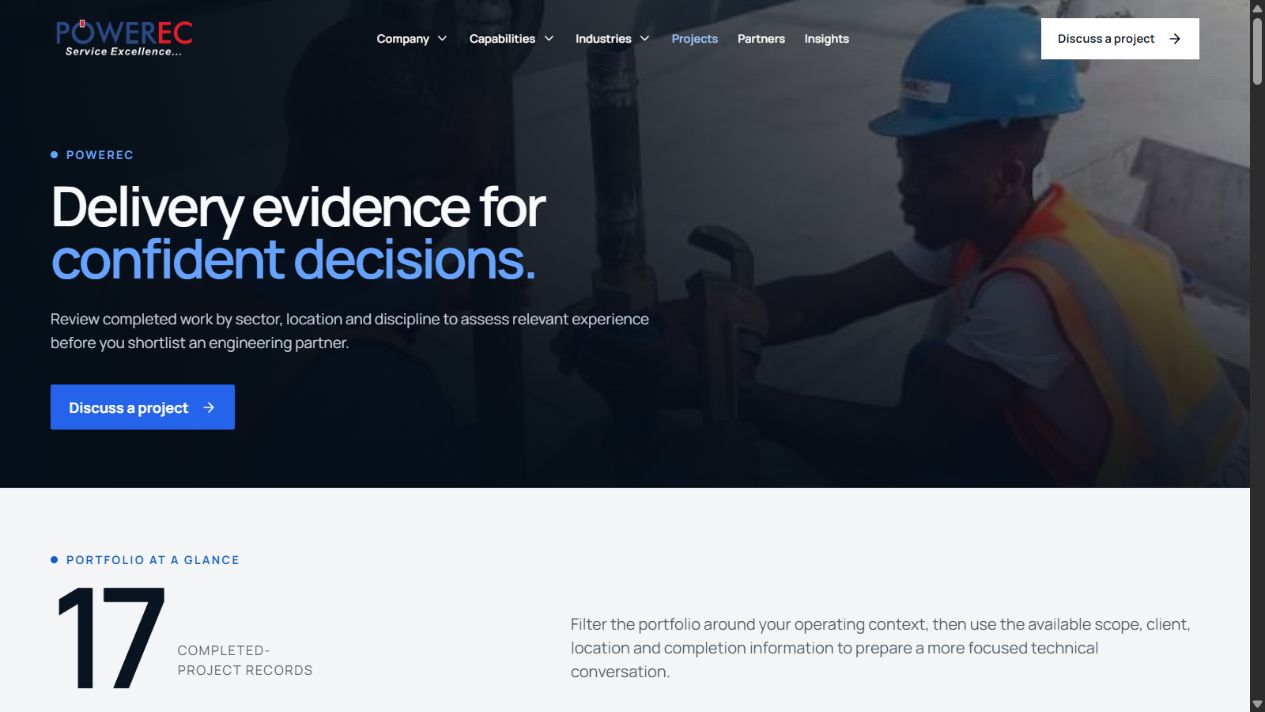
Projects are treated as records, not decorative cards. Sector, discipline, location, and scope create the context a procurement or technical audience needs to judge relevance. OEM partnerships are kept separate so a technology relationship is never mistaken for delivered client work.
Seventeen project records form a browsable proof layer, with clear metadata supporting each claim.
POWERECConversion
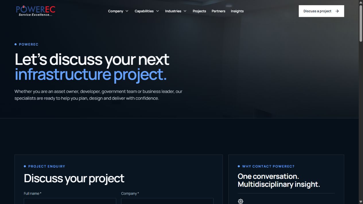
The enquiry flow moves beyond a generic message box. It helps a prospective client frame the project, identify the relevant capability, and share enough detail for a productive first response. The language remains direct and technical without becoming intimidating.
The technical enquiry page carries the same visual system into a more useful, project-aware conversion moment.
POWERECValidation and constraints
Accessibility and quality assurance covered keyboard navigation, visible focus, semantic controls, image treatment, reduced-motion preferences, mobile navigation, responsive typography, and readable contrast over photography.
These checks were part of the design definition, not a final polish pass. The responsive implementation preserves the hierarchy, proof, and conversion path even as complex grids collapse onto smaller screens.
Hierarchy and contrast remain consistent from the first proposition to the final enquiry action.
04Outcome and lessons
This is a self-initiated concept, not a contract or commissioned job, and POWEREC's own website is unchanged. The concept shows how the company could communicate its breadth without flattening its specialist disciplines, connecting the company proposition, capability detail, delivered projects, partnerships, and project enquiry as one continuous trust story.
The biggest lesson was that proof has to be designed into the information architecture. In complex B2B work, visual confidence only becomes credible when every claim has a route to evidence.
7
connected capability pathways
17
project records structured as evidence
6
industry contexts for faster self-selection